
The homepage is seen as the face of the entire website, and the first image of the business that readers approach.
So, you need to pay more attention to the homepage to make a good impression at first sight. If not flawless, including speed and good look, the potential customers will leave your site within the first 6 seconds.
With such importance, I will guide you through the layout of your home page to gain customer impressions and SEO optimization to achieve Google rankings.
1. Have a well-organized layout
A beautiful website should be clearly presented and eye-catching for the visitors.
In the shortest time, usually less than 10 seconds, when readers glance, they can grasp who you are and what your main product is.
This layout is basic for a homepage:
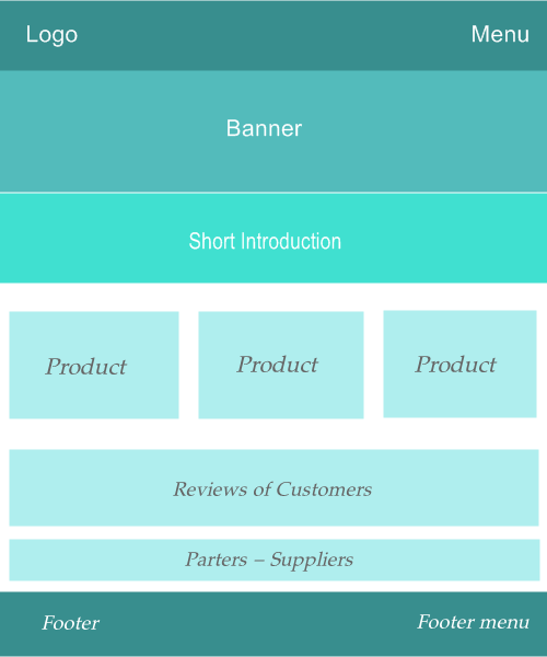
In the above factors, you need to pay more attention to investing in aesthetic images to increase the interest of users wanting to stay longer on your site.
When you have a good structure on a homepage, then you will start working on optimizing it for maximum user experience and high rankings compared to competitors.
2. Range menu layout and important links on it
Menus are areas containing vital links to subpages and the homepage.
The position of the menu is usually placed at the top of the web page, where it is easy for viewers to recognize.
The menu is seen as an essential guide in a forest for newcomers who have just entered a strange land.
So, you need to think carefully about which important links will put on the menu at the top of the page.
Here are the links to consider:
- First of all, the first link is to the homepage. That will be the starting point for traveling to all the ways containing contents. Some websites can link to the homepage in the logo, then you may not need to put the link back to it on the menu.
- A link comes to the product page. If you use a landing page, this will probably be the place to link to it.
- Next, the guiding page is also on the menu. This link is essential to tell the customers how to use the service or purchase on the website. A lot of designers miss this small point, but it’s crucial to have a high conversion rate.
- And a link leads to the portfolio page (about us) that introduces the website owner or company. This action is to create a trust for customers when they are dealing with real people, not an illusion.
- Finally, the contact or order page is a need. Even if you put your email at the top or bottom of your website, you need to have a contact or order page that makes it easy for customers to step into the correct place where you want your customers to do the last action – contact you.
That menu is at the top of the page. Although you may have more items, those links are necessary to put there. You avoid placing too many links on the menu in the header so that the reader won’t get confused.
If you still have a lot of links you want to put in the menu, such as links to blog, sitemap, terms of use… Please place them in the footer menu.
3. Optimize the images on the homepage
Images are one of the indispensable elements in the presentation to impress viewers.
However, images are also the component that makes the user experience go down if you do not pay attention to optimizing them.
To optimize photos on your homepage, you need to pay attention to:
- Reduce the number of images on the page as little as possible. If there are too many images, besides making your website have a slow loading speed, it can also be distracting for users.
- Pay more attention to banners and sliders that should not have too many photos.
- Reduce image size to fit web page frames. Do not use images larger than the format frame size on the web page.
- Optimize image size by using a plugin to optimize images when they are uploaded to your website, or by using image optimization websites before you upload them.
Note that when optimizing images for full-screen banners, I see many people use 1900px, but you should use 1400 – 1500px wide.
4. Choose the correct writing style for reading
The writing on the homepage is also crucial to achieving optimal user experience.
Use 16-18 px sizes of words for desktop formats, and 14-16 px sizes for a mobile look in most text styles. If the font size is smaller than the basic format above, it will be difficult for the readers, leading to getting a high bounce rate.
Besides, you need to pay attention to choosing a font for the homepage appropriately. There should be no more than 3 types of fonts to avoid confusion for viewers.
The Arial font is one of the favorite choices for most websites that you should keep an eye on and be able to use.
Besides, you also note the quantity of words in a paragraph. Shorten the paragraph if it has more than three sentences.
When you break a paragraph, you are making it easier for readers to read and follow the SEO content. Especially on mobile apps, the fact that paragraphs longer than three sentences will be frustrating for readers and they will skip them.
5. Minimize the number of products on the homepage
To optimize page speed and user experience, you shouldn’t put too many products on the homepage, typically for some eCommerce websites.
Use the product trailing feature if possible. If the reader wants to see more, click the button “display more” or “see more”…, then the new product will appear or lead them to another page. This factor is also a key for optimal website speed.
Opposite to the think of many businessmen, showcasing too many photos of products is not necessary for e-commerce sites in the early stages of implementation or when branding is new.
The reason is that to get a client, the potential guests normally view your website 3-7 pages (or times) before pressing the buy button unless your brand is already well-known and the product is paramount or rare.
So, you should recognize your homepage as a transit point to the other subpages. And, let your homepage load quickly by limiting products displayed on it.
6. Put correct Call-to-action button
The ultimate goal of the website owner is to want the customer to comply with a request from the homepage, such as go to the purchase page, contact the owner or a visit to a certain landing page.
Therefore, it is essential to express your wishes by setting paths or call-to-action buttons clearly and noticeably.
When making call-to-action buttons or placing links, you need to highlight this section to become an eye-catching part.
Inside links or buttons, it is essential to add words to motivate viewers, such as: Contact us now, View product page, Book an appointment with us,…
When optimizing to achieve the goal of stimulating the users to make the request, you should take care not to overdo the call-to-action buttons to avoid having the opposite effects when the customers think you are pushing them.
At the same time, the homepage has no more than 3 call-to-action buttons and also does not put too many links (including call-to-action links) to avoid customers not knowing they should click to continue to read or purchase.
Conclusion
Optimizing your homepage is very important to improve the value of your WordPress website or brand.
Do it now to avoid losing out on potential customers who will contribute to the success of your business.
Quickly re-check the homepage, and carefully see if it has been optimized well for users and Google rankings?


Leave a Comment
Log in to post a comment.